Recently in Cross Post Category

UX for Good and the CeaseFire Challenge

*** Originally posted on the Adaptive Path Blog ***

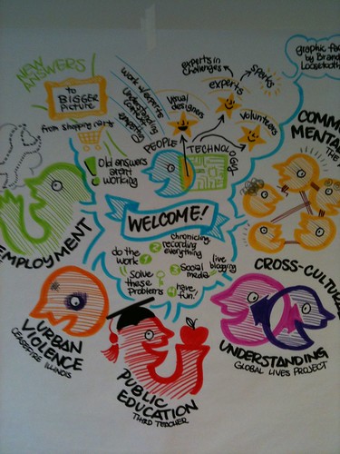
This weekend I had the pleasure to attend UX for Good in Chicago. It was an amazing event, spearheaded by Jason Ulaszek and Jeff Leitner, that focused on solving problems for five social causes: unemployment, urban violence, public education, community mental health, and cross-cultural understanding. I was part of the urban violence team.

Graphic Facilitation Poster by Loosetooth.com at UX for Good

There were nine of us experience designers, a visual designer, and a kick-ass volunteer coordinator. We worked with a group called CeaseFire, based in Chicago. CeaseFire is a campaign that is tackling the problem of urban violence by treating it as a public health problem. Their premise is that if you can stop the violent behavior, and you can shift society’s norms around violence, there will not be as many shootings and killings. They have a network of interrupters, outreach workers and more who go into high-risk neighborhoods and work with the individuals most at risk for causing violence. They support those individuals however they need to, to get them to put down the guns. There is a movie called The Interrupters that just premiered at Sundance that focuses on the work that they do. Our challenge was to look at ways to educate the larger community about the work CeaseFire is doing, to change the larger community’s perception of violence, and channel their support of CeaseFire.

Our team spent the 14 or so hours we had trying to better understand the problems that CeaseFire has, how they work, and what kind of help they need and want. We developed a whole host of ideas of how Well Intentioned Individuals can participate and support CeaseFire.

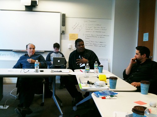
Members of CeaseFire

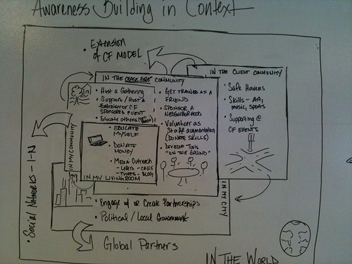
We also developed a model for interaction and context. This model shows the different levels of engagement that can be taken in the different contexts. The model starts in the center with the actions a person can take in their living room, such as educating themselves, donating money and blogging about CeaseFire. It expands out to actions they can take in their community, the CeaseFire community, the client community, their city, and lastly the world. This model provides a framework that the various ideas we came up with can fit into.

Awareness Building in Context

Most of our team members are local to Chicago. They will be following up with different members of CeaseFire to see how these ideas can be put into motion. There is a lot of work to be done, but the initial connections have been made. I’m curious to see how things develop.

One thing for sure is that the conference has changed me. Listening to the stories and watching the videos of the work the interrupters and outreach workers has changed the way I think about my city, San Francisco, and neighboring Oakland. I think all the participants of UX for Good were profoundly touched by the causes and teams they worked on. While the organizations we worked with certainly benefited from participating, I think it’s the effect that work had on us individually that will prove to be the most important.
The Adaptive Path Library

*** Originally Posted on the Adaptive Path Blog ***

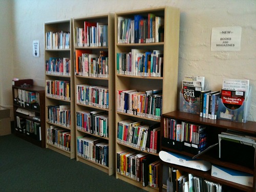
Adaptive Path has a lending library for its employees and interns to use. The San Francisco Library has been around for about four years and we have 488 books in the collection, plus periodicals. I am the Librarian for the San Francisco Library; our other studios are working on creating libraries of their own.

The Adaptive Path Library

The library is run as a small, special library, much like the scientific library at the Rowland Institute at Harvard, where I used to work. There are no due dates and no fines. People check out the books for as long as they need. A few times a year I send a reminder email of the books folks have checked out and remind them to return them if they are no longer using them.

I use Delicious Library as the library catalog. We are still in the process of getting the catalog online. Luckily the collection is small enough that folks can browse the shelves for what they are looking for, or they ask me.

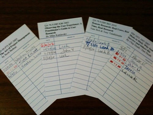
The library uses real library supplies, such as plastic book jackets for hard covered books, checkout cards and book pockets. Each book is cataloged and assigned a Library of Congress catalog number. I decided on Library of Congress because of the technical nature of the books in the collection. Most of the cataloging is copy cataloging using the Library of Congress catalog or OCLC’s World Cat.

Checkout Cards

We don’t have a strong collection development policy. Many people donate books to the library. We have a monthly budget to spend on books. Folks will make requests for a title or I will order something that I think people would be interested in. I send out an email to the company with the new titles whenever I add books.

I think the most important principles for a studio library to have are:

1. A way to keep track of what books there are and who has what checked out.

2. A clear organizational scheme so people can find a book on the shelf.

3. Plastic jackets for hard cover books really does help protect them. The jackets get really beat up quickly otherwise.

I don't think it matters what system (e.g., Dewey Decimal, Library of Congress, your own organizational system) you use as long as it meets those three points. I used a traditional library system because that's what I know and I knew it would scale. The important thing is that the books are there and people can find them and use them.

AP Library Shelves

*** Posted originally on the Adaptive Path Blog ***

Strategy and design are two crucial elements when it comes to site design and development. In my work at Adaptive Path, I've worked on a number of projects that focus on these two key elements. We'll end the project with a stack of deliverables, often including HTML templates and CSS files, the pieces and parts the client will need to move forward.

And yet, this can be an uncomfortable transition at times. We've put in so much hard work to plan and think and design how the features and elements of the site will work. It's now up to the client to take the next leap into Implementation. This can sometimes feel like a murky wilderness, with unknown snares and dangers the client is left to navigate on their own.

Mostly this stems from the fear of the unknown. Sites have a habit of growing organically overtime, and clients are unaware of the implementation processes they have been through in the past. There is a lack of clarity around what tasks and events go into making an implementation successful.

I've put together this this diagram that shows the general tasks that go into a typical site redesign with a new CMS implementation. It shows where the Strategy and Design tasks stop and where Implementation starts. It also shows what roles are involved in the different stages.

Implementation Diagram [PDF: 49KB]

Semantic Technology Conference

*** Originally posted on the Adaptive Path Blog ***

This week I joined 1100 other folks at the Semantic Technology Conference in San Jose. I attended this conference back in 2007 and I'm happier to say I really see a difference in the past two years. Back in 2007, everything about the conference was about the technology. What was the code that made this stuff go? I tried to keep up in a number of sessions where they kept flashing XML up on the screen. I'm happy to report that my experience was much different this year.

From the moment of the first keynote, folks were talking about the user experience. Yay! Our message is finally getting out there. It seems to me that they have finally gotten the technical bits mostly figured out on how to make this semantic web thing go. Now it's time for the fun stuff: using it to power things that make people's lives better.

There seemed to be two big uses for semantic technologies that I heard at the conference. First were the groups of folks talking about plug-ins and snippets of code that anyone can drop into their browser or onto their web pages to make an enhanced experience. Yahoo!'s Search Monkey and Google's Rich Snippets are both examples of simple XML bits that you can add to your pages to enhance your results listing on their engines. Adaptive Blue is a Firefox plug-in that let's you see your friends' reviews of books, movies and other stuff as you look at these items on different sites.

The other use is more like what I traditionally think of when I think semantics. There were lots of examples of vendors who can create ontologies and connections by parsing the corpus of unstructured text you give it, whether that text be email, Wikipedia or the Bible. These tools let you see what topics occur in given populations (such as football and the Longhorns in Enron internal email) as well as moving through those related topics. The guys at The New York Times talked about how they use semantic tools to publish their topic pages as well as their news alerts, widgets, RSS feeds and to automate their editorial process.

It was a fun 2.5 days. I learned a lot and am eager to update my personal sites with Rich Snippets, RDFa and microformats.

Join me on Wednesday, June 24 for my virtual seminar on the semantic web. I'll explain the basics of how this stuff works and why user experience folks need to be involved.

--- Originally posted on the Adaptive Path Blog ---

About a year ago, Jesse came to me and suggested I change my title from Information Architect to User Experience Designer. He gave a number of reasons, but none of them resonated with me. I clearly remember commiserating with some dear friends at the IA Summit 2008 about this proposed change in title.

I didn’t want to give up the title. I considered myself an information architect first and foremost. I’ve called myself an IA for nine years now. I was proud of the name. It was who I was. So I didn’t change it.

In Memphis this past weekend, at the IA Summit 2009, I spent a lot of time talking with first time attendees and those new to the field of information architecture. I hosted a round table at lunch for those new to IA. They were a great table, with tons of questions.

One of the things they really wanted to know was how to become a great IA. My answers surprised me. I didn’t tell them that they had to master multi-faceted classification or be able to generate thesauri and controlled vocabularies from scratch. I didn’t tell them about stencils and templates for making better wireframes.

I told them how important it was to listen to the customers of the organizations they would be working for and to deeply understand their behaviors and motivations. I told them to be champions for the user. I told them to listen to the pain of their clients, and think about how their designs could ease it. I told them not to go in shouting about CVs and classification and indexing and how their clients were doing it all wrong. Be subtle, I said. Listen for their needs. Present classifications and metadata and all that cool stuff as the way to get your designs implemented, not as an end in and of itself.

And I realized… I wasn’t telling them how to do good information architecture. I was telling them how to do good user experience design. I realized while I love IA, and it is my core competency, it is also only a small part of what I do.

For that reason, I am taking on the title of User Experience Designer.

IA as Stone Soup

--- Originally published on the Adaptive Path Blog ---

I've been looking for a metaphor or a model that I could use to describe how the Information Architecture day of UX Intensive is structured. The day is focused on metadata, controlled vocabularies, classification schemes and search. They sort of build on each other, but not in a simple, neatly stacked way. I was thinking about this while in Copenhagen a few weeks ago, when the answer hit me: Stone Soup!

Do you remember the story of Stone Soup? It's a Grimm Brothers' tale about returning soldiers and their guise to get a selfish, starving town to learn the lesson of cooperation and its benefits. They can make soup from their stone, but it will be a more tasty and filling soup if they get the whole town to pitch in and add ingredients.

Information architecture is like Stone Soup. You can make a website without explicitly thinking about the IA. You don't have to use metadata or control your vocabularies or develop thesauri. You don't have to tweak your search engine and play with recall and precision to improve your results.

But it will be better if you do.

Putting structure into your unstructured data allows you to make your site that much better. It's a way to "plus" it. A way to add some "BAM" to your site, to borrow a phrase from Emeril Lagasse. Because it's easier to slice and dice and do interesting things with structured data than it is when your data is a big, undifferentiated mass.

IA from a stone? Fancy that.

Tag Spamming Is Not a Best Practice

*** Originally posted on the Adaptive Path Blog ***

This weekend I attended the BlogHer conference in San Francisco. There was lots of talk about traffic to blogs, and what you can do to increase readership, and generally promote your blog. Most of advice made sense, but there was one thing mentioned that got my blood boiling.

I was in a session on DIY Content Syndication and Promotion, and one of the audience members asked how you could use tags to help with promotion. One of the speakers, I don't remember which one, advised that the best way to use tags is think of the most general topic you post is about and tag with that. Also, if you are commenting on someone else's post or video, you should copy all of their tags and add a few of your own.

Um... excuse me? Sure, that's best practice if you want to add tag spam, water down results and piss off people when they come to your post only to find that you are tangentially related to the topic they are interested in. Remember, it was this broad spectrum, shotgun approach to tagging that taught search engines they couldn't rely on the keywords metadata field..

The rules for tagging are very simple:

  1. Tag only significant mentions.
  2. Tag at the level the item is about.
  3. Use one tag per concept.

I like to use this rule of thumb to check to see if the tags I've chosen are accurate: If I did a search for the tag I'm considering, would I be happy getting this post/image/content item? If the answer is no, I drop that tag.

Following these rules to tagging insure that your tags are appropriate for your post/image/content item. Targeted tags help ensure that recall as well as precision are high. You want the folks who are interested in your specific topic to find your thing. If you are talking about the giant green dinosaur with glowing red eyes in South Dakota, you don't want to tag your post with general terms like "United States" or "statues." Better choices would be "Wall South Dakota," "dinosaur statue," "glowing red eyes," and "kitschy roadside attractions."

Desiging Search Checklist

*** Originally posted on the Adaptive Path Blog ***

Recently on projects I've found myself designing a number of search results pages. While each project has its own set of requirements and nuances, I think there are a handful of elements that should be included in most all result page interfaces. If you start out with this list, and then tweak as your situation requires, I think you'll end up with a pretty good page.

Here are the items on my checklist, in no particular order:


  • Highlight the query term in the results.

  • Restate the query on the results page.

  • Show the number of results that were found.

  • Include next and previous buttons, as well as links to additional pages, to move through results. These should be smartly linked; no link on previous if you are on the first page and so on.

  • Include a query box so the user can search again.

  • Don't show the URLs of the result pages, unless your audience is techy enough to derive meaning from the URL.

  • Have meaningful page titles and descriptions for each result.

  • The page title should be the link to the result.

  • Allow sorting and refinement tools if appropriate for your users and content.

  • Indicate if a result is not a regular page (e.g., a PDF file).

What items do you have on your checklist?

What To Do With Unused Letters?

--- Originally posted on the Adaptive Path Blog ---

I'm a big fan of indexes. There are many a content-focused website whose content could be made more findable with an A-Z index of the site content. There are lots of places on the web that talk about the merits of such indexes. Most will tell you to put a row of the alphabet at the top of the index, and have the letters be quick jumps (i.e., anchor links) to that section of the index.

But what about those letters that don't have any entries? Do you show the letter and have it link to a message saying there's no entries? Do you show the letter but have it not hyperlinked? Do you just remove the letter all together? Which option gives the better user experience?

This very question came up recently on a project I'm working on. My gut told me to show the letters but not make them links. But why? I looked high and low on the web for someplace that told me which was the better way, but I couldn't find anything. Looking at examples of indexes wasn't overly helpful for I saw sites doing it in all kinds of different ways.

So I turned to the wisdom of the crowds. I asked the question on Twitter and Plurk, as well as the Argus Associates Alumni. (Thanks to everyone who responded!) The overwhelming response was to show the links not hyperlinked, AND grayed out.

I also got multiple reasons for why this is the better approach:

  • It preserves the pattern of the alphabet and makes glancing easier.
  • Users don't wonder why some letters are missing, which can make it look broken.
  • It saves users from getting to a destination just to find out there's nothing there for them.
  • Some back-end work is saved if content is added in those areas in the future.

So there you have it. Be sure to include your unused letters at the top of your index, but gray them out and don't make them links.

The 5 Senses on Twitter

--- Originally posted on the Adaptive Path Blog ---

Like most folks in the office, I've joined the Twitter bandwagon. I find it's an easy way to keep in touch with folks I don't see on a regular basis. And learn new things about those a I do see.

Graph of the 5 senses on TwitterJust now I checked out Twist, a site that lets you chart how much folks are twittering about a topic and plots them against each other, over time. It's a neat way to see how topics ebb and flow. I thought it would be neat to see how much the five senses are talked about on Twitter.

I think it's fascinating that folks Twitter the most about things they see so much more than any other sense. I would have thought that smell would have ranked higher. I wonder if it's because we are used to sharing things we saw with our cell phone cameras. Or if it's just part of human storytelling. "You'll never believe what I saw on the way home today..."

About this Archive

This page is an archive of recent entries in the Cross Post category.

Crafts is the previous category.

Design is the next category.

Find recent content on the main index or look in the archives to find all content.

Archives

Recent Comments

  • Laura Zucchetti: Speaking as someone who started out as a jack of read more
  • Kate: Hey Chiara: This is a wonderful post. I am so read more
  • Lisa Paul: Wow. This is great. I always try to shop proactively read more
  • Elisa Camahort Page: Thanks Chiara!! Hope we will see you in Chicago this read more
  • Chiara: Hi Conner- That's great that you are happy with the read more
  • Conner Versione: I used these guys for my website www.cellularbling.com. They did read more
  • Conner Versione: Conner, I used these guys to add a video to read more
  • Mamacita: Wow, I've been quoted! Thank you so much for those read more
  • scotter: Yes, I guess that anger hangover is right. read more
  • anger hangover: i've been blogging for a few years and i don't read more
Powered by Movable Type 5.04